Rona has mandated me to optimize their online retail store. Over a 3-year, I conducted several optimization projects to enhance the online client experience and optimize the overall conversion rate. Besides working on wireframes, I also design some of the key sections of their e-commerce site.
Company
Rona
Role
UX/UI designer
[ View website ]
Updating the Category Pages
UX and content optimization
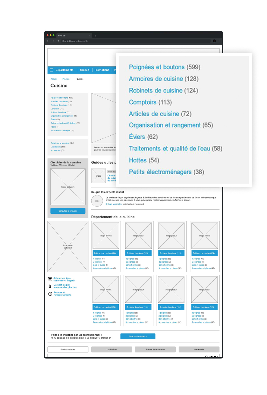
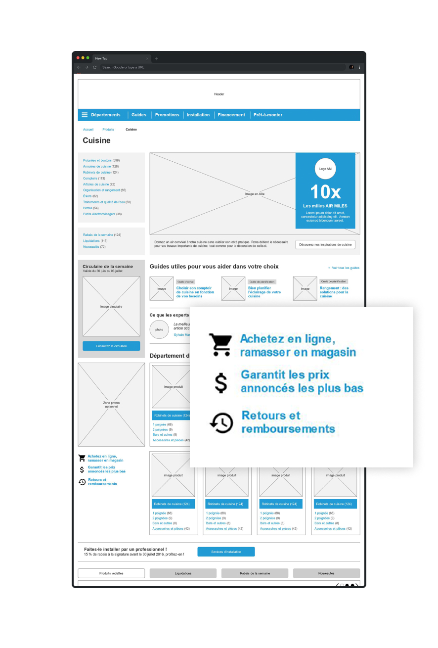
Sub-category links
Users can quickly narrow down their research with the sub-category link menu.
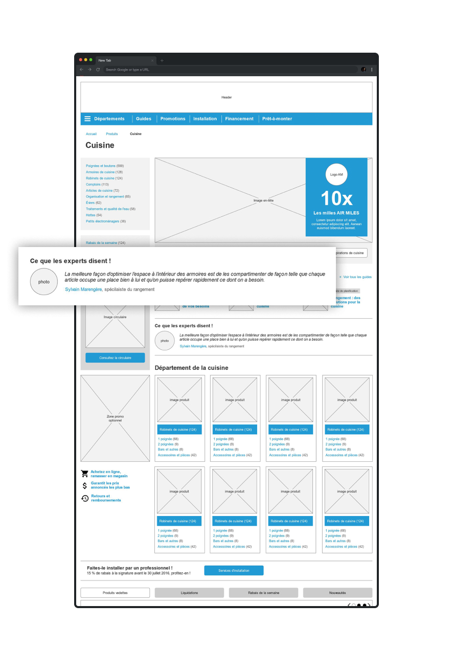
Expert Tips
The website contains loads of information and tips on how to use the products. This section is used to highlight useful tips.
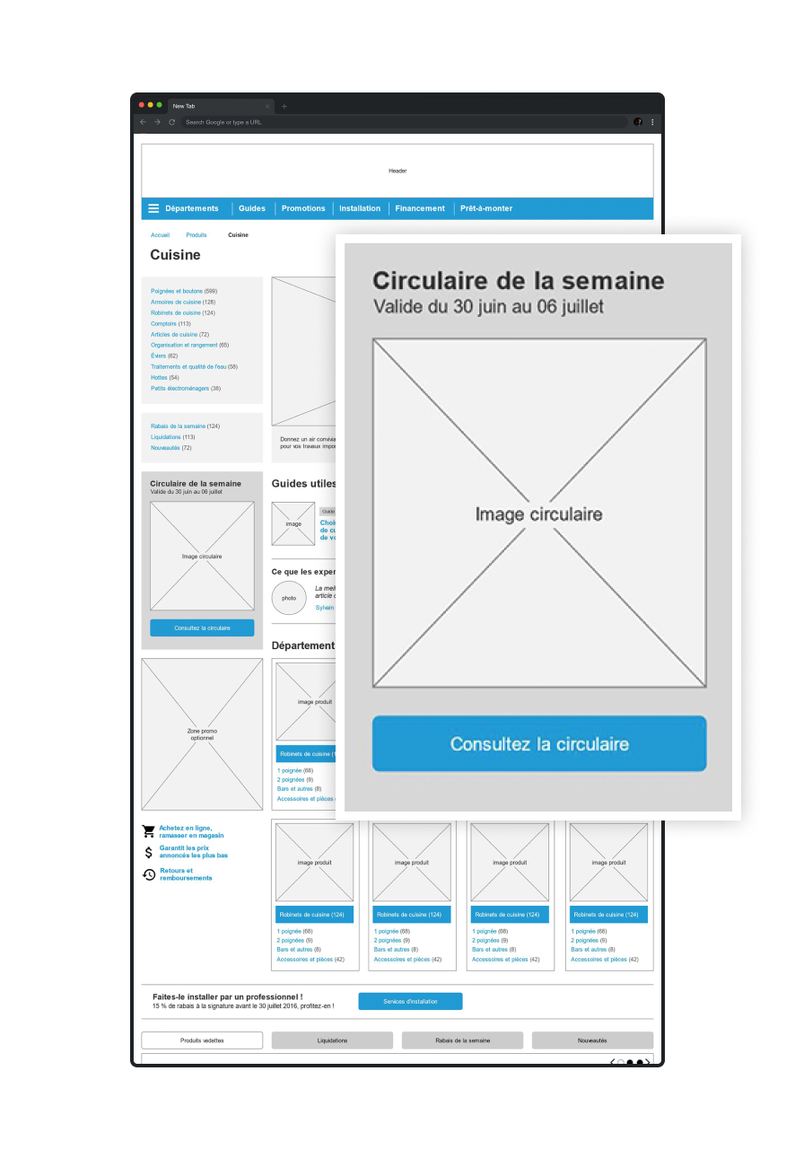
Weekly flyer
The weekly flyer is still very popular amongst users looking for the best deals. Therefore, this section is used to show the actual cover of the current flyer.
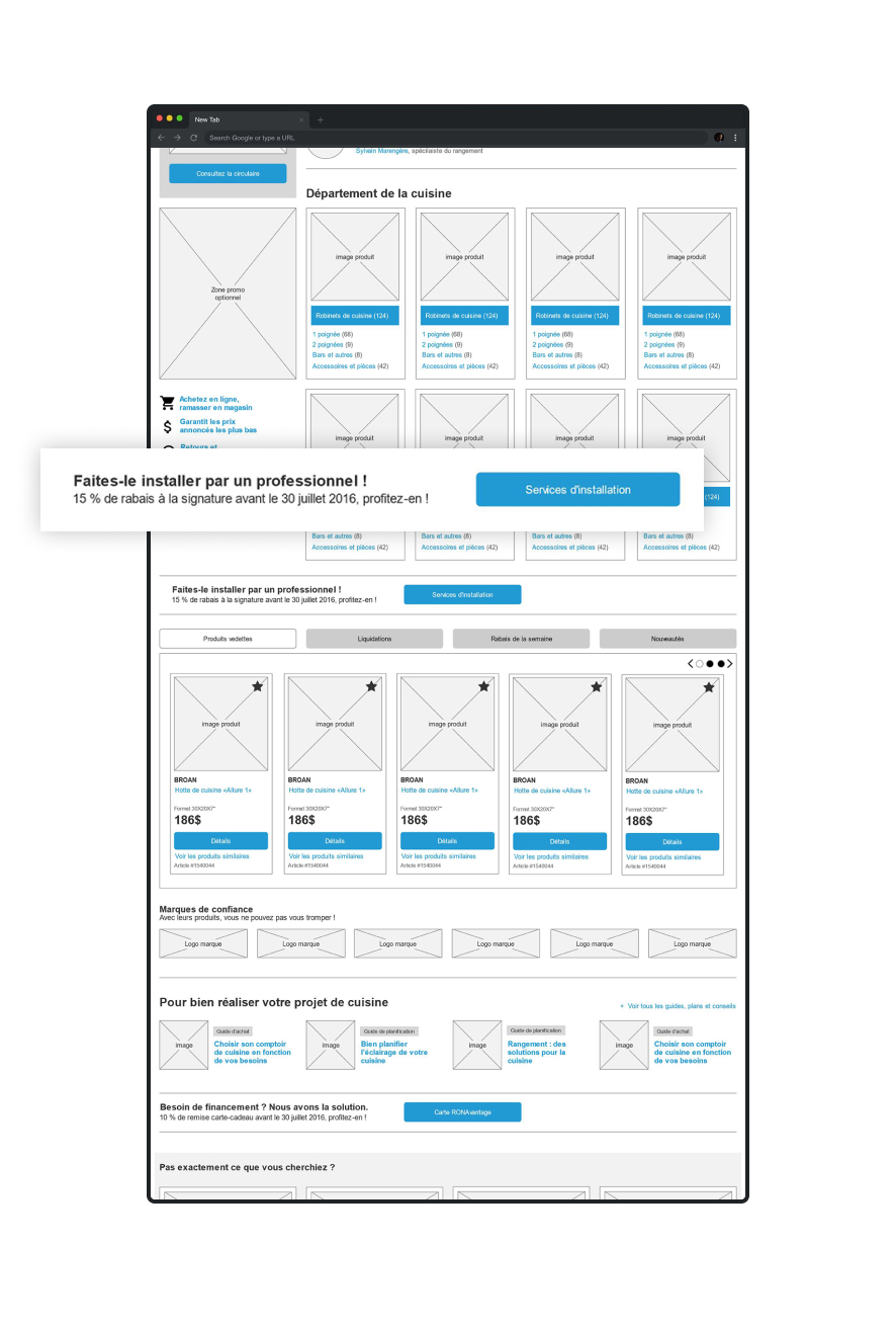
Installation services
When a category can be linked to the installation service, users can learn about it in this section.
Buyers information
The return policies and price guarantees are more visible in this new layout.
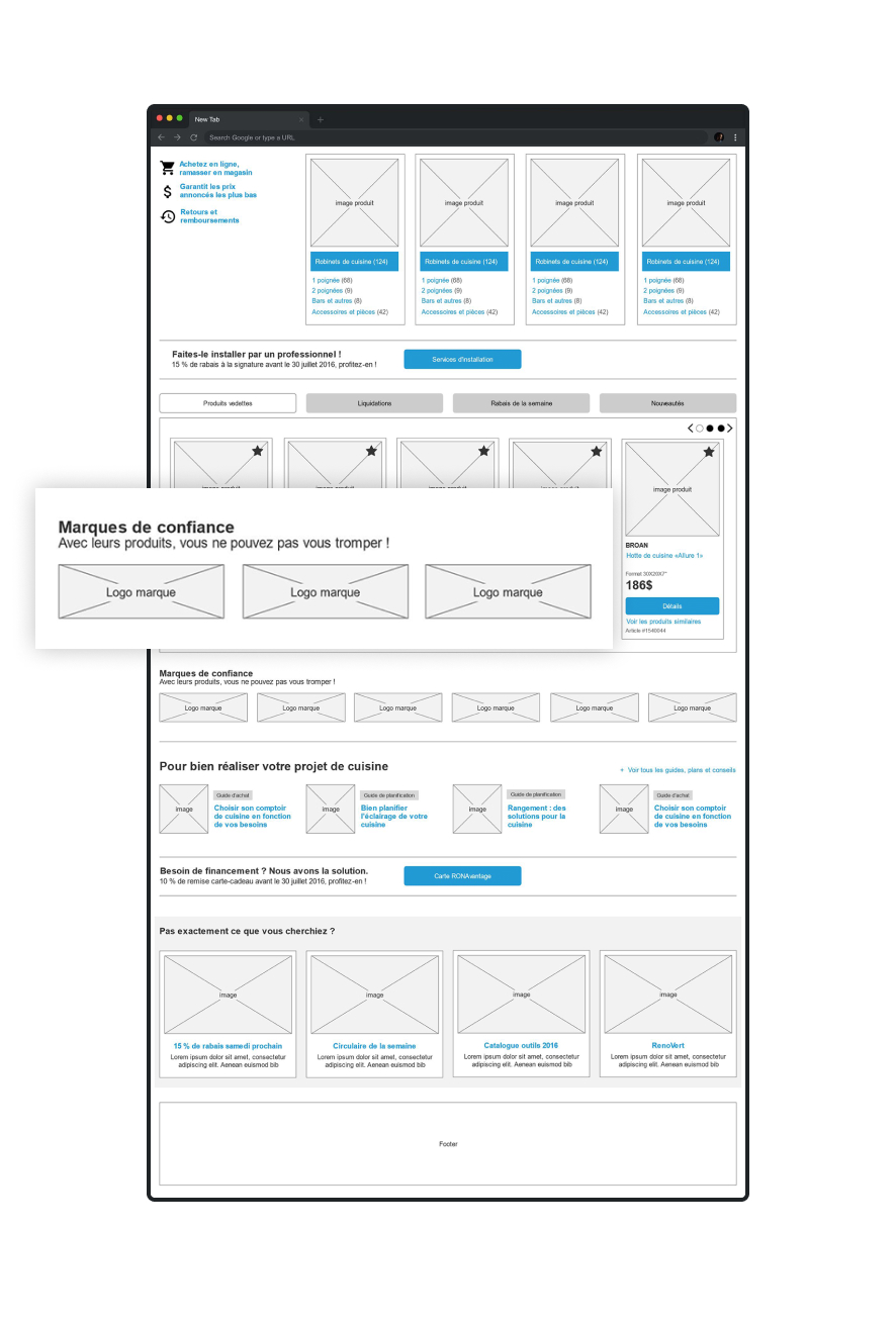
Available brands
Users looking for a particular brand can quickly locate the name or logo of each available brand of the category.
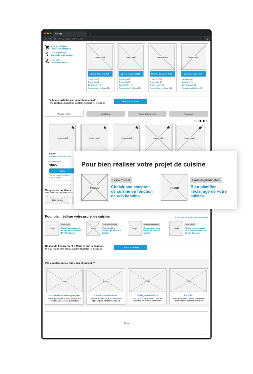
Useful content
Different guides are displayed directly on the category page.
Updating the Product pages
UX and content optimization
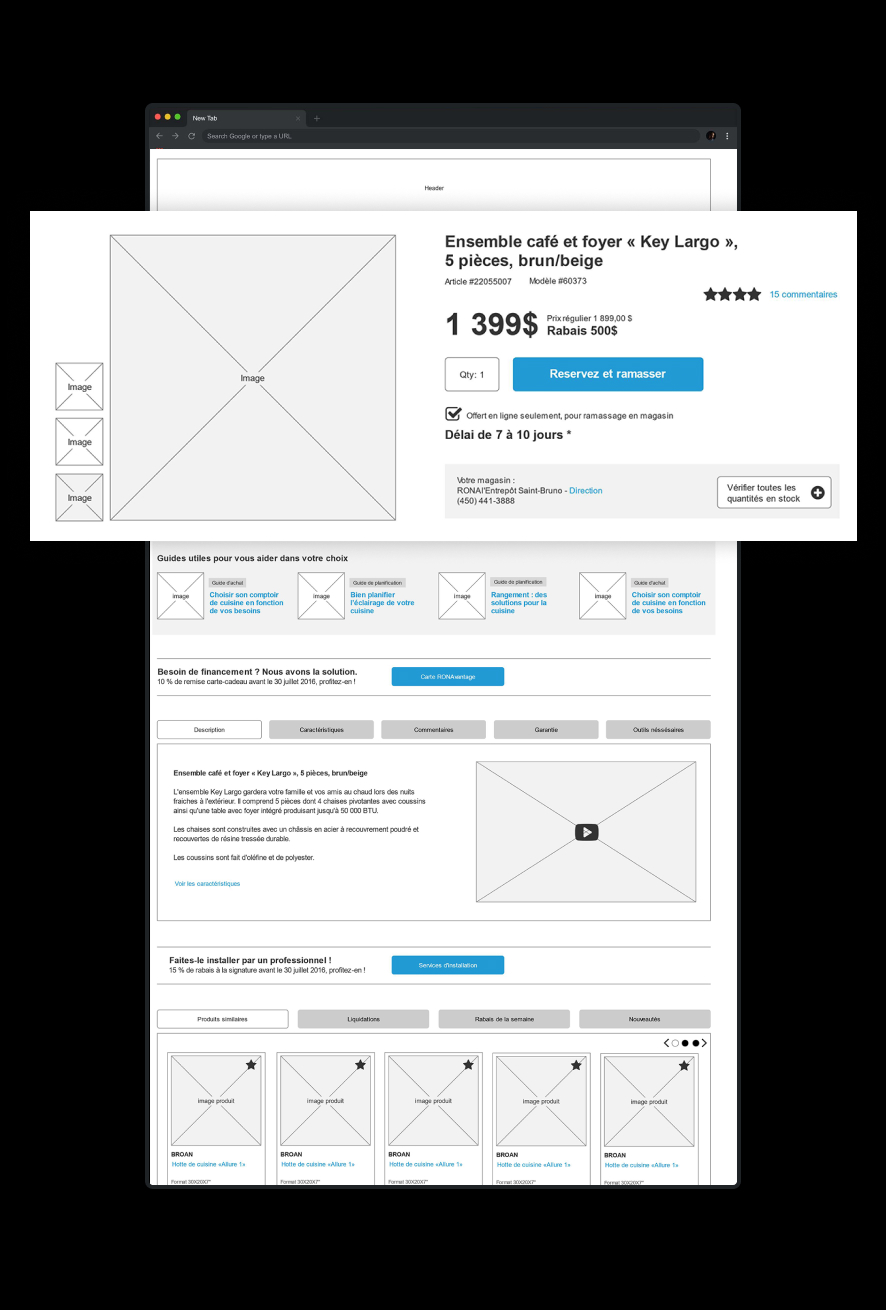
Product information
Users can quickly locate important information about the product at the top of the page.
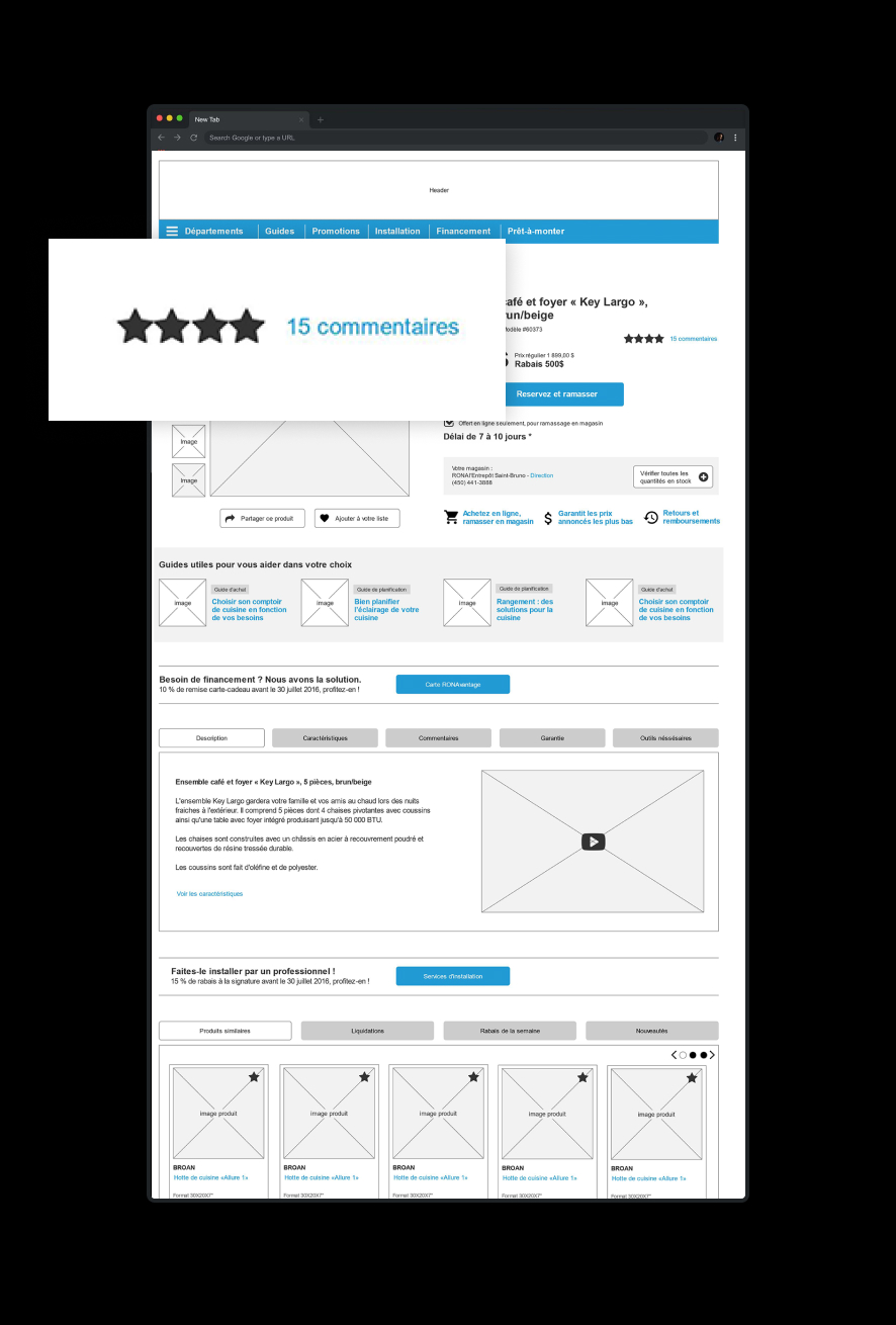
Ratings and comments
Ratings and comments are an effective sales tool and can largely increase the conversion rate.
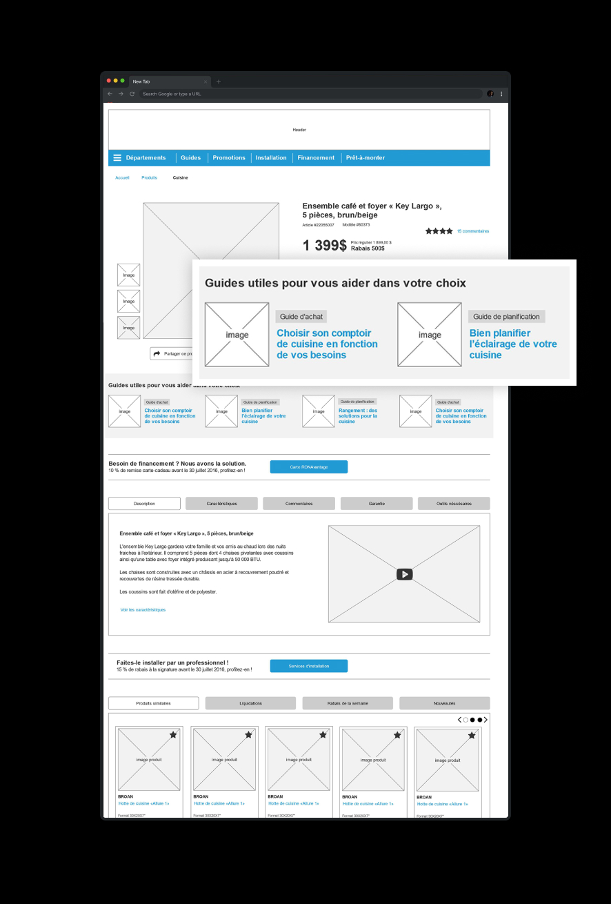
Useful content
Useful guides and articles about the product are presented to the customers.
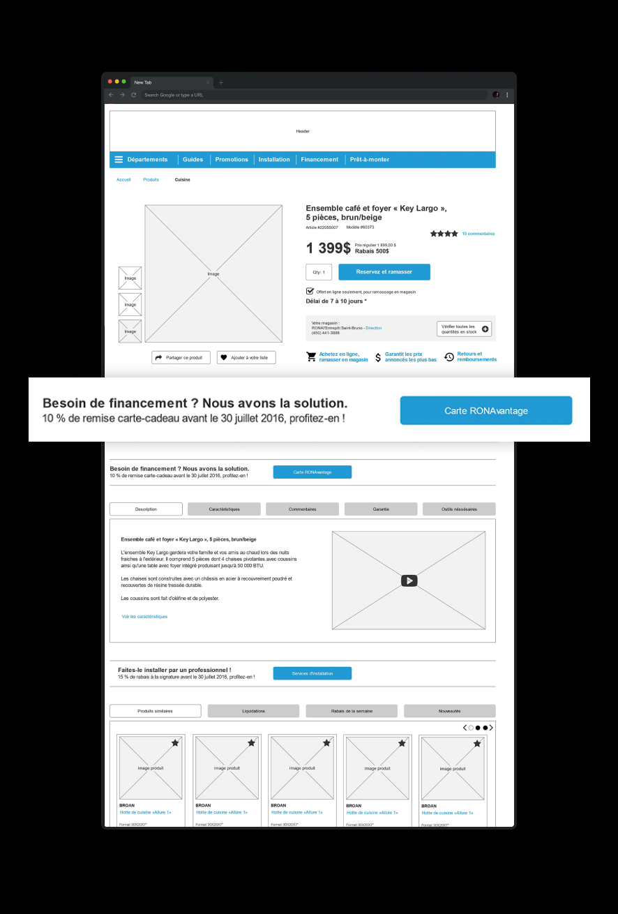
Financing option
Users who could need financing for their purchase have access to all the financing details.
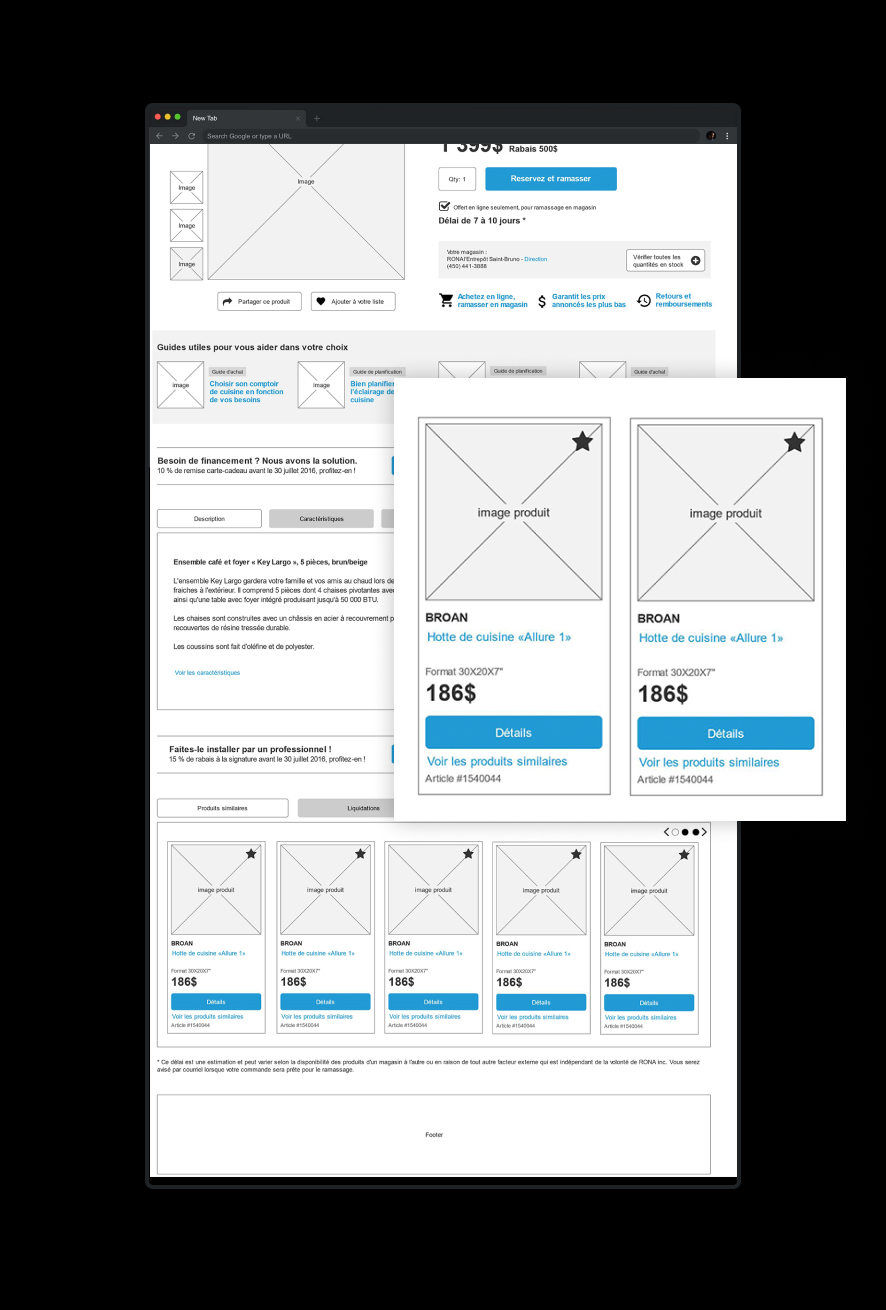
Other products
The return policies and price guarantees are more visible in this new layout.
UX design for the Rona installation services
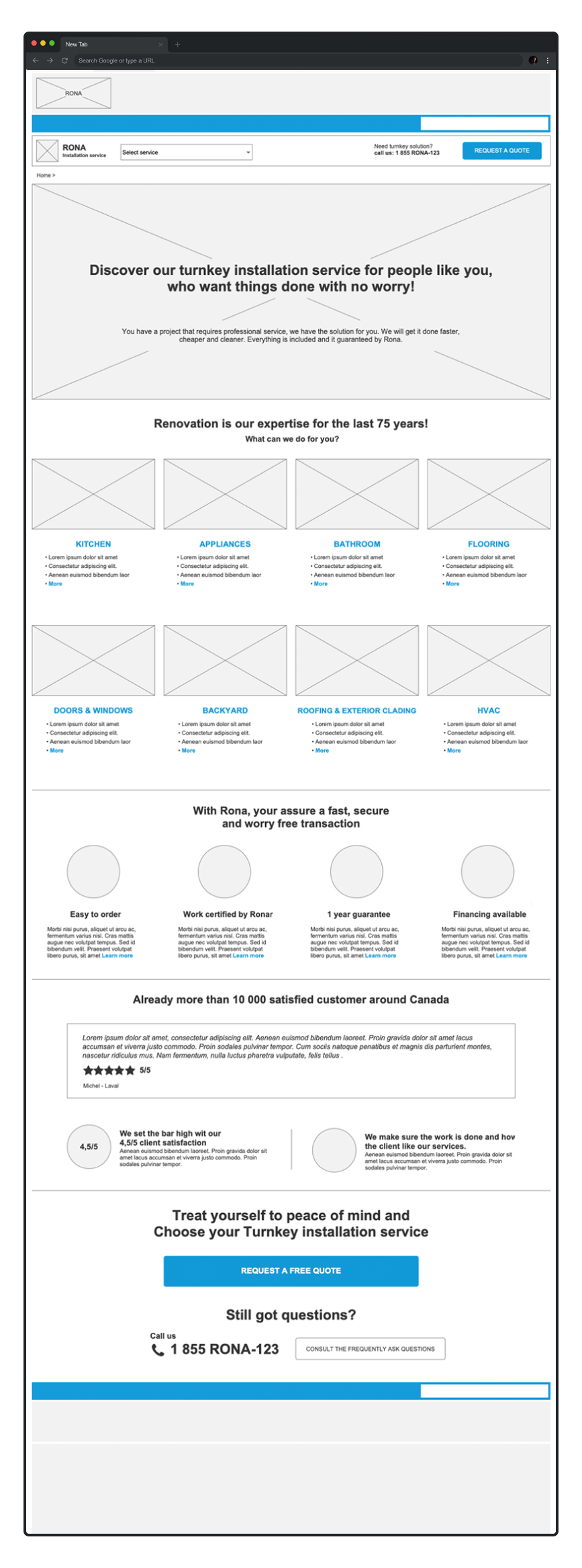
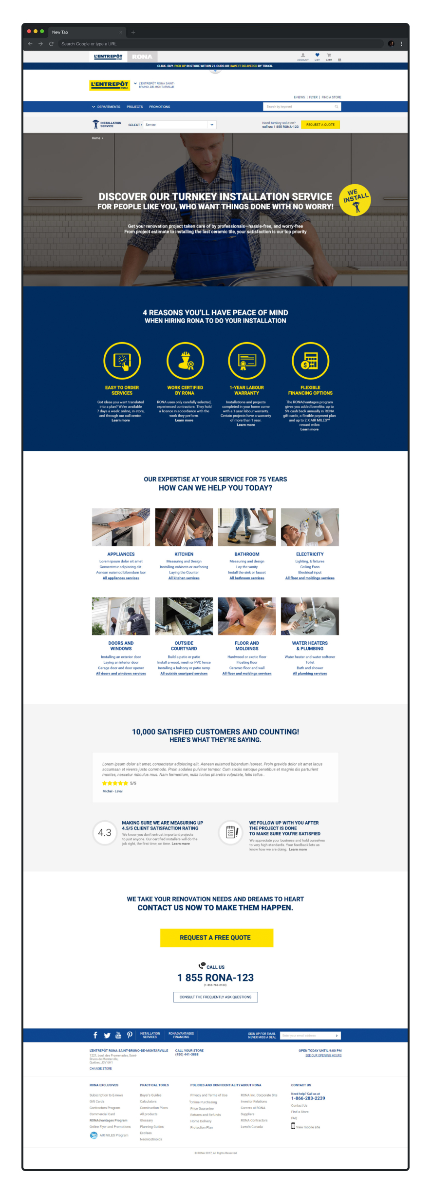
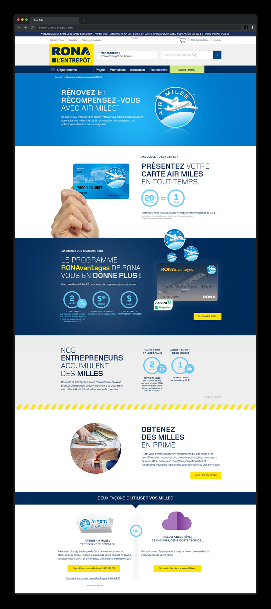
To increase the awareness of their installation services, RONA wanted to redo the UI/UX of their Installation service pages. I was mandated to structure the information and create wireframes and designs.
A New Responsive Version of RONA’s Website
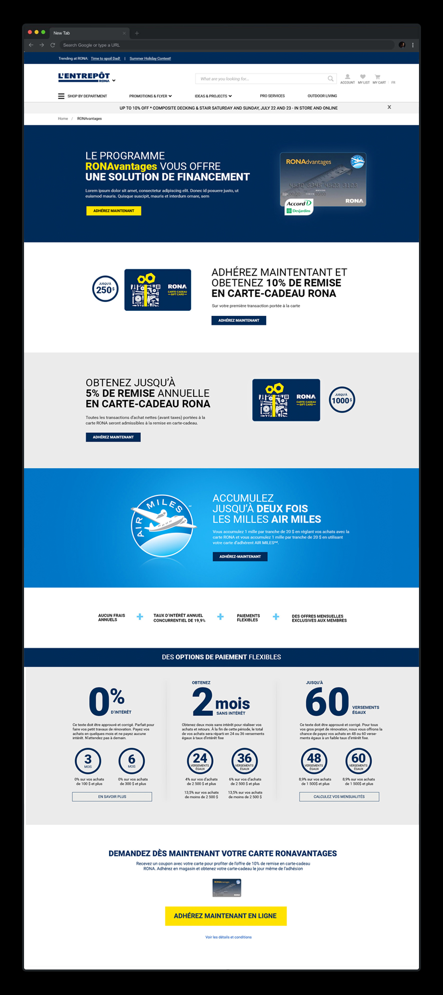
I worked with their internal design team and created various designs for specific sections of the website.
RONA had a desktop and a mobile version of their website, and updating the content and promotions every week was a very time-consuming task. In an attempt to be more efficient and increase their organic traffic on mobile, they came up with a new responsive version of the website.
Want to Know More About My Design Process?
Check out these case studies about my latest projects.