Hilo
I led the design efforts for Hilo's Energy Management System for commercial buildings. The design was completed quickly, allowing Hilo to meet its deadline and deliver a functional EMS to its clients. Hilo's stakeholders were pleased with the results, which demonstrated the effectiveness of my design approach.
Company
Nventive, for Hilo Energie
Role
UX/UI designer
[ View website ]
Delivering on time an intuitive EMS dashboard
Experience taught me that a good solution today is better than a perfect one tomorrow.
Ensuring the product meth the user requirement and the short deadline.
The Impact
- Project timely delivered
- With only 2 months before the deadline, I provide stellar design work. Considering the limited time, I had to follow a strict roadmap.
- Improved velocity
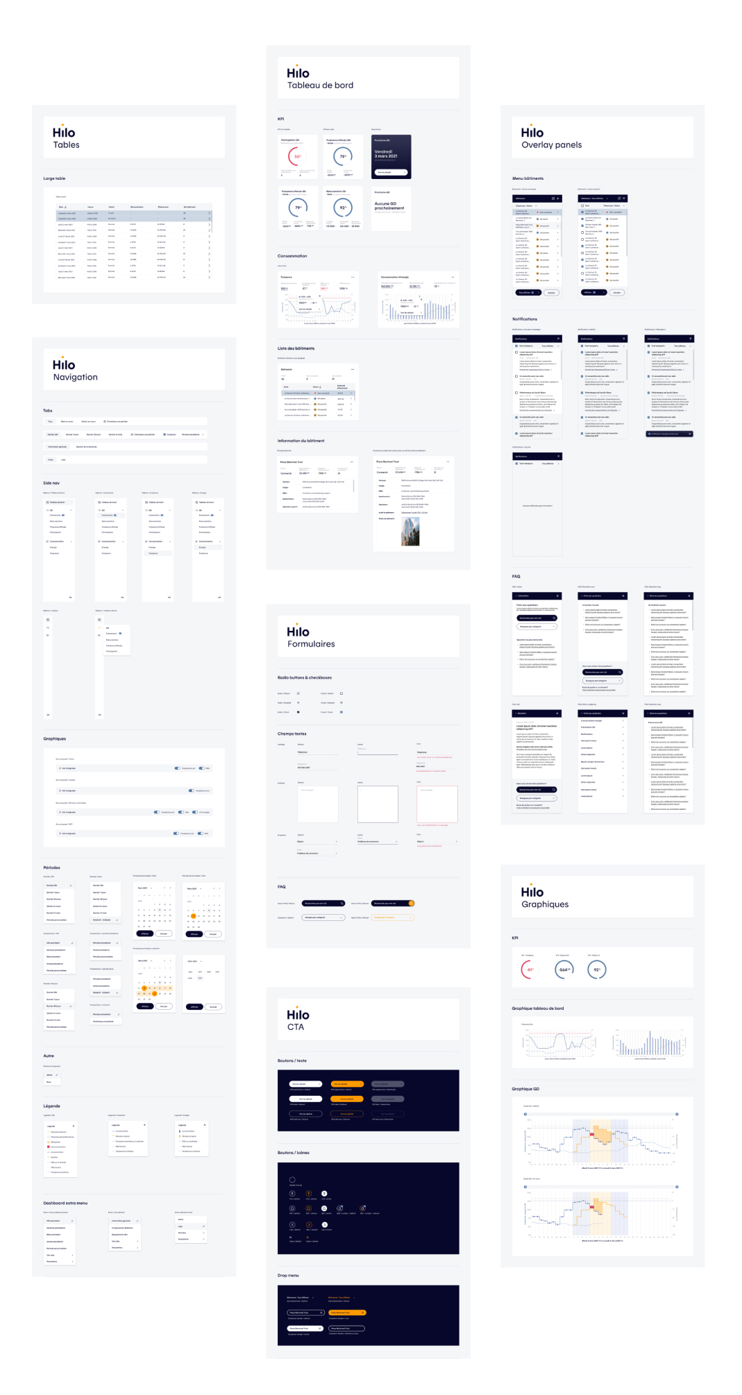
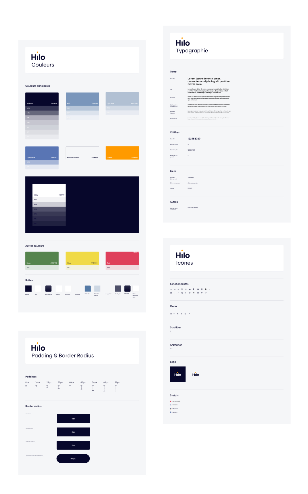
- By developing a simple design system, the development team could be more productive. Eliminating the guesswork during the design hand-off.
- Comprehensive data visualization
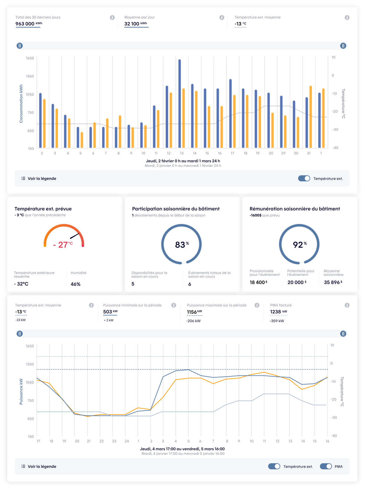
- After searching and testing different graphics to visualize the complex data coming from an energy management system, I proposed a solution that met aesthetic and functional requirements.
LET’S DIVE INTO THE DETAILS
The Project Was in Jeopardy
A first team of designers work on the initial prototype of Hilo’s EMS dashboard. They managed to create a viable prototype to get the stakeholders’ approval, but it didn’t meet the user’s needs.
Hilo was developing its first EMS for commercial buildings. Hilo gives cash incentives to limit energy consumption to avoid system overload during peak hours.
Hilo needed a functional beta version before the end of the ongoing intense cold period of winter. The beta phase couldn’t be pushed to next year since some of Hilo’s clients were already waiting for the EMS to be integrated into their smart building system.
Therefore, rapid design iteration and approval were mandatory.
The Solution
Design an EMS Dashboard That Meets User Needs
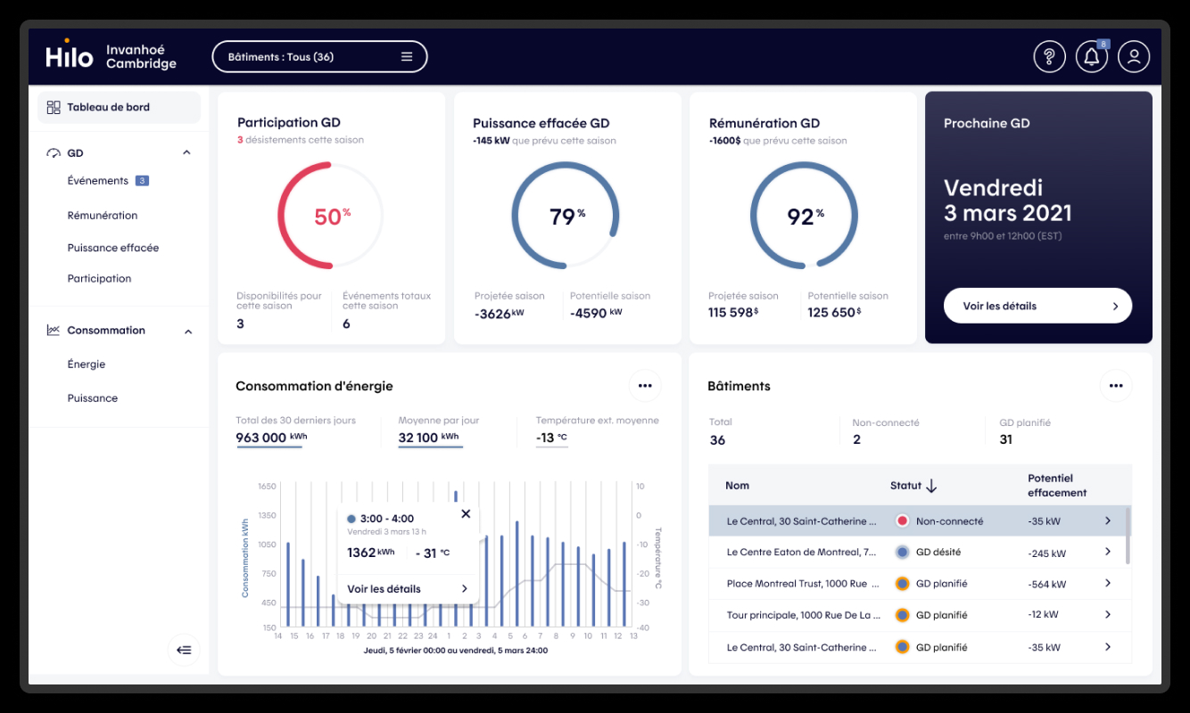
I designed a solution that focused on simplicity and ease of use. Ensuring that the EMS dashboard provides only the most relevant information to building managers.
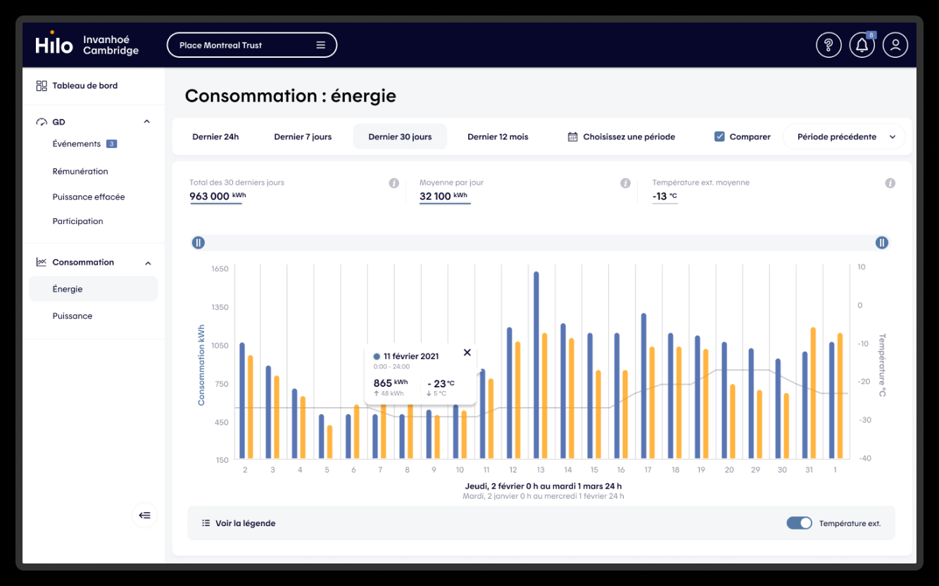
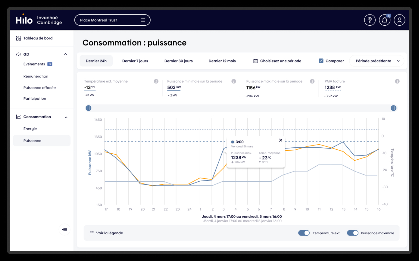
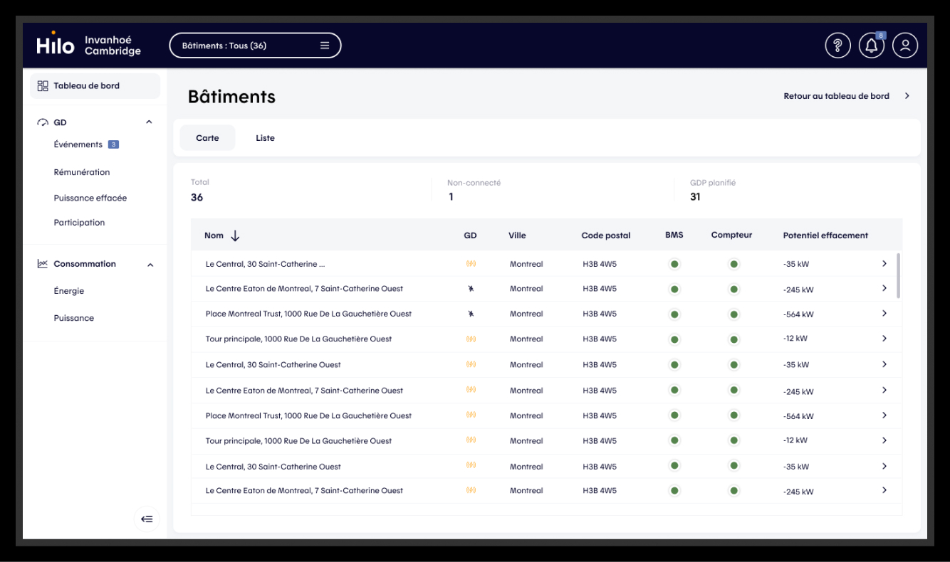
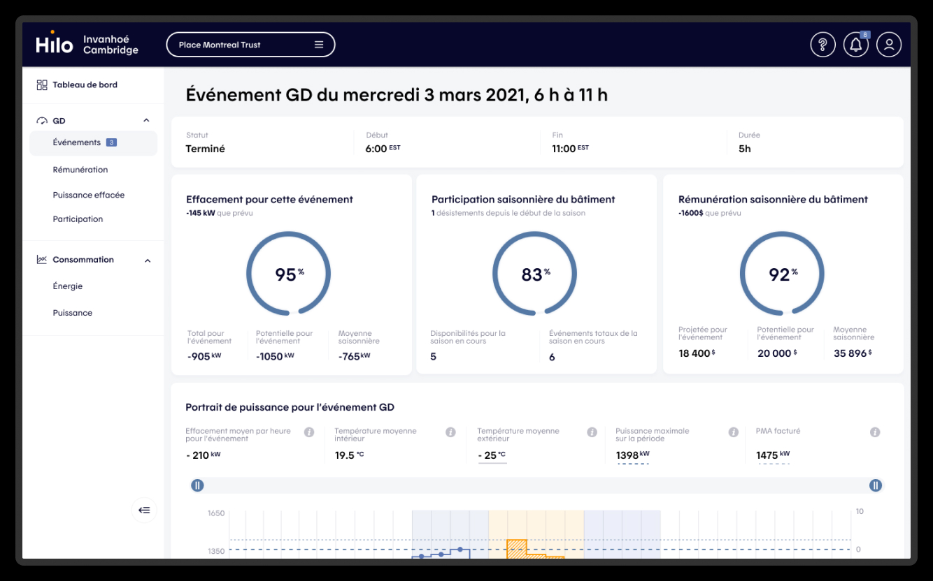
Now, let’s break down the solution.
Understanding stakeholders vision
First, I interviewed 3 stakeholders from the Hilo team.
Each gave me insights on how to make this dashboard work.
- 1- The project's director
- She already had all the information that was presented to other stakeholders and also used to enroll the client in the beta testing phase. Therefore, I understood the expectations and features vital to the project.
- 2- The BMS specialist
- He had extensive knowledge about how these systems were implemented in buildings. Moreover, he had firsthand experience with other systems and was able to highlight the pros and cons. Therefore, I avoided the common pitfalls and created an experience that surpassed industry standards.
- 3- The lead engineers
- I’ve collaborated with the engineers for the whole process. I was constantly reaching out to the lead to get feedback on the feasibility of the dashboard. He was able to help find the best graph library to kick-start the project.
Understanding User Needs
I’ve gathered as much information as possible by interviewing Hilo’s team.
I collected user research that was previously conducted to build their business case. Moreover, with my limited time, I did some extra research by looking at LinkedIn Profiles and groups. By doing this investigation, I could understand more about their tasks, goals, and pain points.
This level of user research was enough to build a good enough beta version that would be put between real users’ hands. After that beta phase, we will collect real feedback and adjust accordingly.
Translating data into comprehensive visuals
I proposed and iterated on a graphical representation of energy consumption data that met aesthetic and functional requirements. Putting the right information at the right time in front of our user’s eyes.
Moreover, I ensured the design process was efficient and effective by fostering a positive working relationship with the development team.
Balancing precision with speed
The Hilo EMS project illustrates the need for designers to learn how to balance precision and speed.
By taking the time to readjust the plan and listen to the team, I was able to transform complex requirements into user-friendly designs. I delivered a product that met both the client’s needs and the users’ expectations.
The results of the Hilo EMS project were incredibly positive, with the design receiving high praise from both the client and stakeholders.
Because Hilo’s mission aligns with my values as a human, I look forward to contributing to future projects that continue to revolutionize the energy management industry.


